WordPress mobile performance is how fast your site loads and responds on a real phone over a real mobile network, and it is almost always much worse than the numbers your team looks at. The reason is simple: most WordPress speed claims are measured on the wrong device. PageSpeed Insights shows a desktop-first number by default; most performance plugins benchmark against fast US fiber; and your team tests on the same laptop the developers use. Then Google measures Core Web Vitals for real mobile users on 4G in your slowest country, treats those numbers as your actual performance, and uses them to inform rankings.
That gap, between the speed you measure and the speed Google measures, is the highest-leverage performance work most WordPress teams can do this year. Picture a restaurant that times its kitchen only when one regular orders a single dish at 3 pm, then is shocked by bad reviews during the dinner rush. The quiet test was never the real test. For your site, the dinner rush is a mid-range phone on a busy network, and that is the experience Google scores.
This guide explains why mobile is so much slower than your tools show, what "good" actually looks like on mobile, and the five fixes that close the gap, in the order of impact.
Why WordPress mobile performance lags your tooling
The default mobile profile on PageSpeed Insights is "Slow 4G," with about 1.6 Mbps download speed and a 150ms round trip. That is actually faster than what many real users get on a real phone. Real-world data from Chrome's CrUX (the Chrome User Experience Report, which is Google's record of how real Chrome users experience your site) consistently shows the 75th-percentile mobile user on:
Effective bandwidth around 0.7 to 1.4Mbps after radio inefficiencies.
Round-trip time of 200 to 400ms in suburban or rural areas.
A CPU 4 to 6 times slower than a developer laptop (think a mid-range Android phone).
The combined effect is large. A page that loads in 1.8 seconds on your laptop can take 5 to 7 seconds on a real mid-range phone. A hero image with a Largest Contentful Paint of 1.4s on desktop can be 3.8s on mobile. Your "good" score from office Wi-Fi becomes "needs improvement" from your customer's living room.
What "good" actually looks like on mobile
These are Google's published Core Web Vitals thresholds. LCP (Largest Contentful Paint) is how long the biggest element takes to appear, INP (Interaction to Next Paint) is how quickly the page responds to a tap, and CLS (Cumulative Layout Shift) is how much the page jumps around while loading.
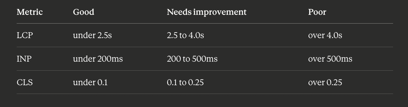
These are measured at the 75th percentile across 28 days of real visits. That means your slowest 25% of users- the rural users, the users on older phones, the users on busy networks- fall outside these thresholds, and Google knows it. To pass consistently, your median mobile experience needs to be well below the threshold, not just at it.
The five high-leverage mobile fixes
This is the order we work in when an audit verdict is "mobile frontend bottleneck."
Fix 1: Handle the LCP image properly
On a WordPress site, the Largest Contentful Paint element is the hero image at the top of the page about 90% of the time. That image does the most damage to your mobile score, and it is also the easiest fix. Four moves:
Serve modern formats. AVIF if your CDN supports it, WebP otherwise. JPEG carries roughly a 50% size penalty today. Most managed hosts and CDNs (Cloudflare Polish, Bunny Optimizer) do this with one toggle.
Resize for the actual viewport. A 2000px-wide hero loaded onto a 360px phone wastes about 5x the bandwidth. Use
srcsetandsizesso the browser picks the right size.Add
fetchpriority="high"to the LCP image. This one-attribute change tells the browser to prioritize that image, often saving 200 to 400ms.Do not lazy-load the LCP image. Many themes default to
loading="lazy"on every image, which means the hero does not start downloading until layout finishes, defeating the point. Mark it explicitly:
<img src="hero.avif" loading="eager" fetchpriority="high" width="1200" height="600" alt="...">Done well, these four moves alone often shift a 4.0s LCP to under 2.5s.
Fix 2: Defer the JavaScript you do not need for first paint
WordPress pages typically ship 200 to 800KB of JavaScript, most of it for things that do not need to run before the user sees the page: analytics, chat widgets, sliders, lightboxes, share buttons.
The cheap audit: in Chrome DevTools' Coverage tab, load your page on the mobile profile and look for scripts with over 50% "unused bytes." Anything matching that should be loaded with defer (so it parses after paint) or loaded only on user interaction (a click, a scroll past a threshold, or an idle callback). For sites with many plugins, a per-page script manager like Plugin Organizer can dequeue scripts without editing the theme.
Fix 3: Subset and self-host your fonts
Most themes load fonts from Google Fonts or Adobe Fonts. The first request to an external font host adds DNS, TLS, and a round-trip, usually 200 to 500ms before a single font byte arrives. Self-hosting removes that cost. The pattern that works:
Download the woff2 files for only the weights and subsets you use (regular and bold, Latin only).
Self-host them inside your theme, for example under
/wp-content/themes/your-theme/fonts/.Use
font-display: swapso text renders in a fallback font during load.Preload the most important font in the head:
<link rel="preload" href="/fonts/inter.woff2" as="font" type="font/woff2" crossorigin>This usually saves 200 to 400ms on mobile LCP.
Fix 4: Stop the layout shift
Cumulative Layout Shift is almost always caused by images without explicit width and height attributes (the page reflows as each one loads), ads or embeds that load without a reserved slot, or web fonts that swap in at a different size than the fallback.
The first cause is the easy win: every <img> needs width and height so the browser can reserve the space before the image arrives. Modern WordPress core adds these; legacy themes and image-heavy plugins often do not. CLS is also the metric most likely to fail intermittently, because your dev environment has a warm font and image cache so you never see the shift a fresh mobile visitor sees. Always test in an incognito window on a real device.
Fix 5: Match real-user (field) data
PageSpeed Insights shows two things: Lab Data (a single test in a controlled environment) and Field Data (real users, pulled from CrUX). Your Lab Data can look perfect while your Field Data is broken, which means real users have a worse experience than your tests show. The gap is usually a specific page you are not testing (like /checkout or /cart), a specific country with worse networks, or older devices you do not own.
The fix path: open Google Search Console's Core Web Vitals report, which breaks results down by page group, and treat the worst page group as its own problem to solve.
[INSERT IMAGE HERE using the orange Image button: URL https://boltaudit.com/og-default.svg, alt "WordPress mobile Core Web Vitals: LCP, INP, and CLS on a phone". Swap the URL for your real thumbnail before publishing.]
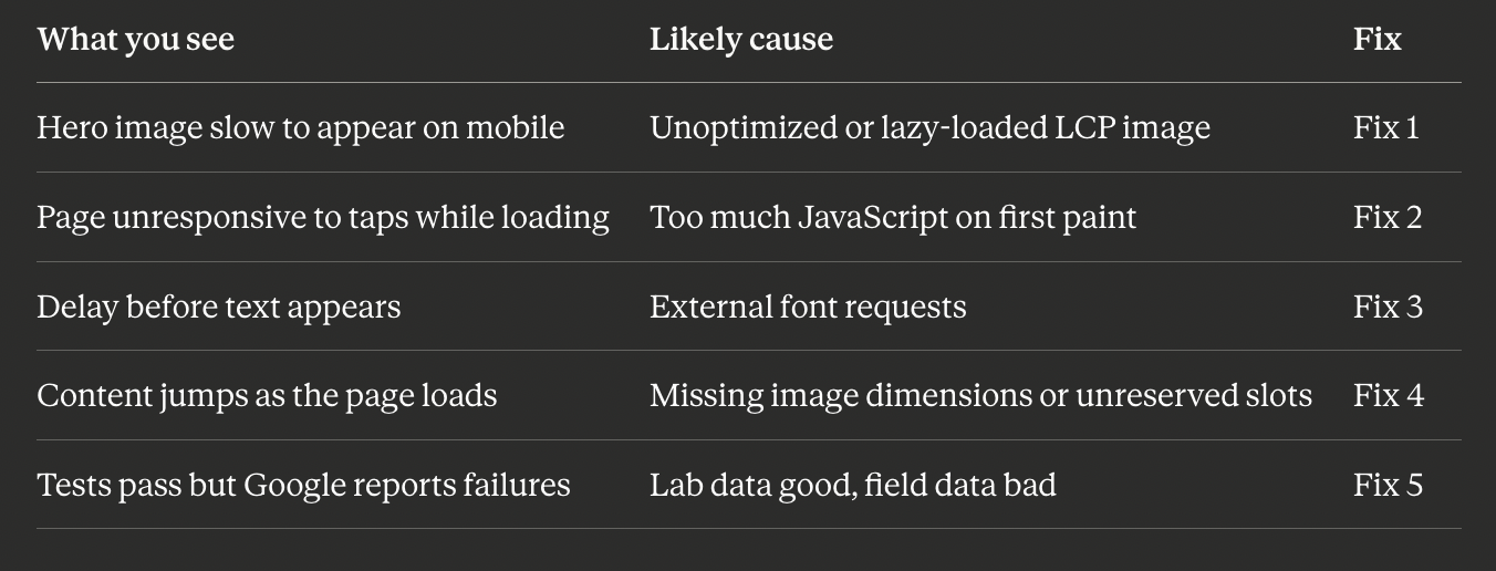
Symptom to fix: a quick reference
A safety note before you change the theme
Most of these fixes touch theme files or image settings. Before editing functions.php, dequeuing scripts, or changing how images are served on a live site, especially a WooCommerce store where a broken script can interrupt checkout, back up your files and test on staging first. The rule is simple: any change you cannot instantly undo gets a backup first. A backup turns a risky change into a reversible one.
How BoltAudit finds your mobile bottleneck
Running all five checks by hand, on the right device profile, takes time and tooling. You can have it done automatically.
[Make the word BoltAudit below a link with the chain/link button: https://wordpress.org/plugins/boltaudit/]
BoltAudit is a free, AI-powered WordPress performance audit plugin that runs more than 200 read-only checks across frontend, backend, database, and infrastructure in under 90 seconds. Its frontend layer runs the five checks above against your live site, picks the highest-impact fix for your specific page, and estimates the projected mobile LCP win. Instead of a generic 47-item list, you get the few changes that will actually move your mobile Core Web Vitals, ranked by impact. Read-only means it never writes to your database or edits files, so it is safe to run on a live production or WooCommerce site. Audits are located under Tools> BoltAudit in your WordPress admin.
Keep mobile fast over time
Mobile scores drift as you add plugins, fonts, and images. A light habit keeps the gap closed:
Re-audit on the mobile profile after any theme change or new plugin.
Check Search Console's Core Web Vitals report monthly, by page group.
Always test a fresh visit in incognito on a real phone, not just your laptop.
Run it on your site
If your desktop scores look great but you suspect mobile users are having a worse time, you are probably right. Install BoltAudit free, run a Local Audit from Tools, then BoltAudit, and let it tell you the single highest-impact mobile fix for the page that matters most.
Run BoltAudit on your site
Free plugin · 1 site · 3 audits per month · no credit card.